Making your mark
Over the years we've carefully crafted dozens of logos for our clients and we're proud to share some of our favorites. Our logos have won numerous state and national design awards, including being published in LogoLounge.
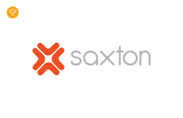
Space matters
Saxton has been in the commercial interior industry for more than 40 years, specializing in creating thoughtful, elegant spaces in healthcare, commercial, residential and education sectors. We updated their look with a modern logo inspired by timeless and iconic furniture design crafted by Knoll and Herman Miller.
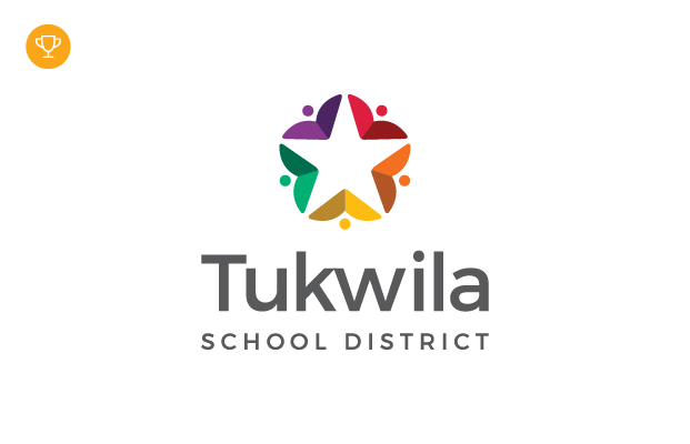
Representing the nation’s most diverse school district
Tukwila School District, located just south of Seattle, Washington, is the most diverse k-12 school district in the United States because of its strong immigrant and refugee communities. The students speak more than 60 world languages, some of which even Google doesn’t translate yet! The multicolored mark represents the diverse student body that makes Tukwila School District unique. The white star symbolizes student achievement and potential.
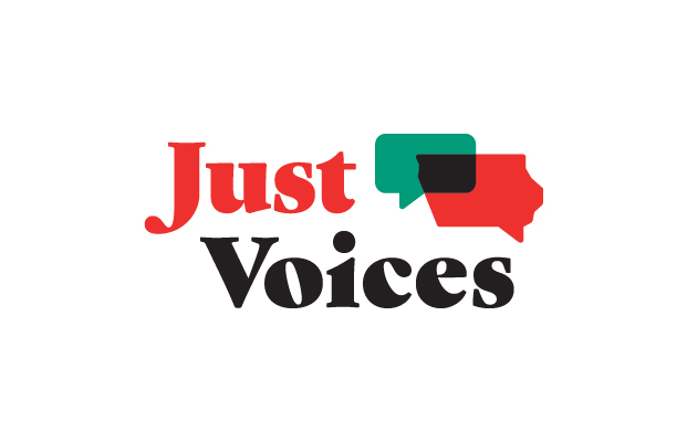
Speaking up for justice
Just Voices is a Des Moines-based organization founded on creating a more equal justice system by focusing on racial bias in local policing. We creating an website (coming soon!) that amplifies true stories and facts alongside an urgent call for equality. The logo focuses on intersecting identities, ideas and collaboration for a better Iowa.
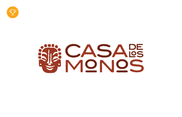
Welcome to the monkey house
Casa de los Monos is a Mexican mansion, now a bed-and-breakfast in Puerto Vallarta, with an eclectic history. Taking over 20 years to complete, Dr. Jose Vicente Angel’s sandy, rocky castle is rooted with history and culture. The logo is inspired by the ancient statues of monos (monkey gods) which are embedded in the castle’s walls!
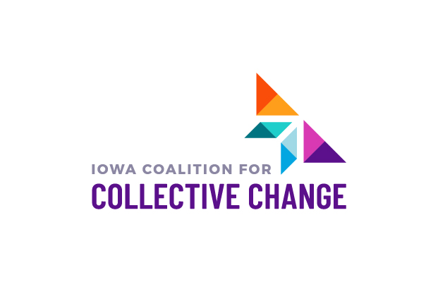
Soaring above adversity
Iowa Coalition for Collective Change provides organizational training, research and legislative advocacy for victim services in marginalized communities. ICCC identifies the needs of these communities and works to increase anti-violence prevention and victim assistance.
The butterfly-shaped logo is a symbol of transformation and resilience. The colors also carry strong meaning. Purple for domestic violence awareness, teal for sexual assault awareness, orange for energy and blue for of hope. The space between the butterfly’s wings creates a perfect white arrow, indicating upward movement and progress.