From Harvest Gold to Millennial Pink: colors that defined the decades
When you picture the 1960s, what colors come to mind? Perhaps psychedelic colors, warm oranges, reds and yellows? What about the 1970s? Perhaps that would be the colors of disco and lava lamps. How about the 1980s? That would be bright cyan, red, purple and yellow, right? The 1990s? How about today? It’s no surprise that colors come in and out of fashion all the time, but what were the influences behind the palette of the 1950s versus the 2000s? We took on the challenge to capture the decades with a simple color palette, sourcing inspiration from American pop culture, fashion, marketing, technology and design. Here are the colors that defined the last 100 years.
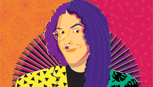
2010s: Exuberant Minimalism
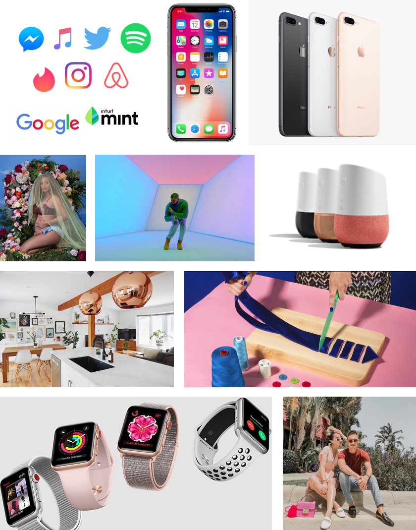
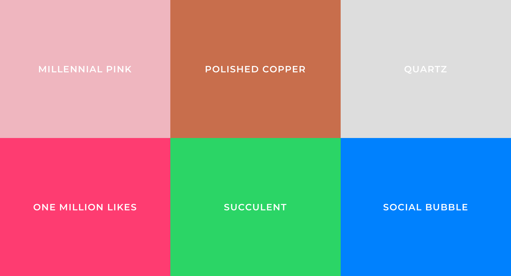
The 2010s are known for many things: nostalgia, hipsters and minimalism. From interior design to technology, a growing interest in minimalistic, well-crafted and thoughtfully-designed items became status symbols. The most trendy interiors today feature rustic wood finishes, metallic or stone surfaces, polished copper and brass accents, and cozy deep green tropical plants all carefully arranged before airy sun-bleached white walls.
While screen resolution, camera quality and technology grew more complex, digital design simplified to what we call flat design. Flat design is constructed from geometric shapes edged with delicate drop shadows topped with simple sans-serif typography. The ensuing color palette, however, introduces a more fantastical element to the style. Joyful gradients, surrealistic saturated color is a delightful experience for users.
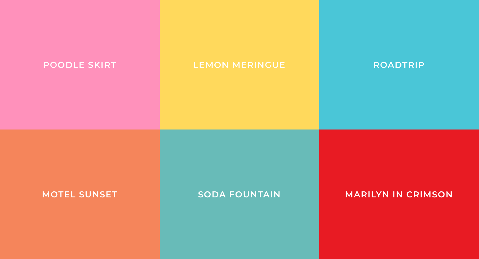
And then there’s millennial pink, arguably the most iconic color of the decade. For years the color has been inescapable. Wes Anderson’s The Grand Budapest Hotel featured the color, from the stately hotel’s facade to Mendel’s pastry boxes. Apple featured it as an iPhone color for the first time in 2015 (called Rose Gold), putting the color into the hands of millions. Pantone granted the color spotlight in 2016 when its variant Rose Quartz and a baby-blue Serenity were named 2016 Color of the Year. The color can easily be found anywhere in the world of design and there’s no sign we’re ready to quit it.
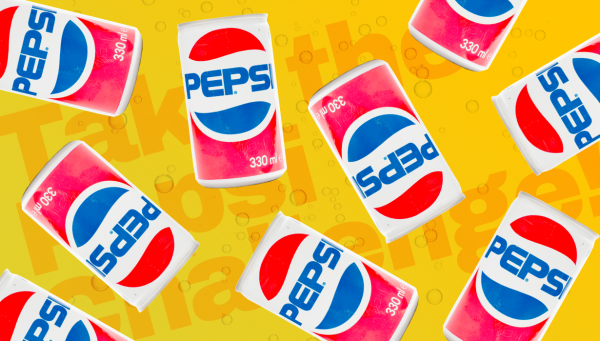
2000s: Bursting in to the Millennium
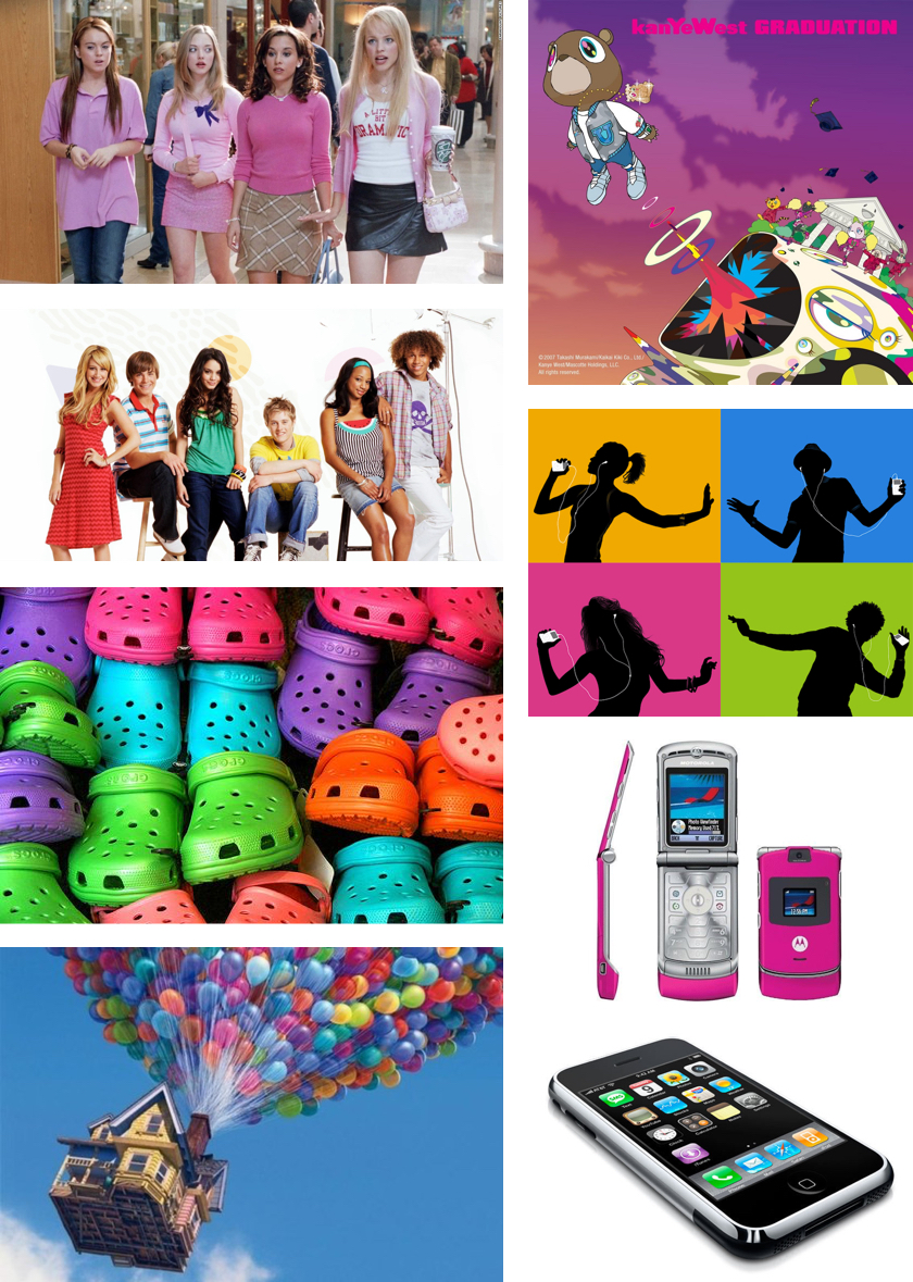
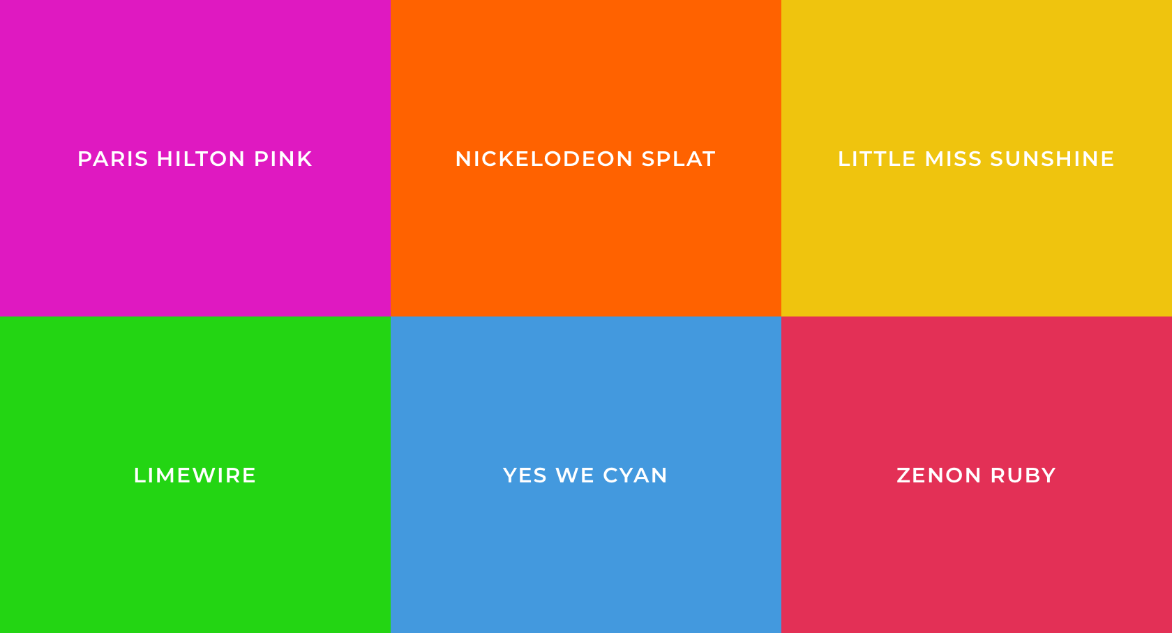
The 2000s were marked by a time of decadence in the culture and innovation in technology. Some of the iconic shows of the time closely followed the lives of extravagant Americans, real or fictional — Paris Hilton from The Simple Life, rich teens from My Sweet 16, the outrageous cast from The Jersey Shore, Carrie Bradshaw in Sex and the City, Gretchen Wieners from Mean Girls and, of course, Kim, Khloe and Kourtney Kardashian from Keeping Up with the Kardashians. Skinny jeans finally stuck as a fashionable item, but unfortunately, so did Crocs.
It was also a notable decade for Apple. The company released the most popular portable music device in history: the iPod. Newer iterations of the device became smaller and more candy-colored. Each new generation of iPod nanos had more colors, and by the 4th Generation, there was an array of 9 colors to choose from. The iPod was finally discontinued in 2017. In 2007, the iPhone was released, making smartphones accessible to billions of people around the world. The skeuomorphic design was the trendy aesthetic, especially in web and print design. Skeuomorphic design is known for its faux real-world objects with realistic textures and colors affixed to the two-dimensional world.
Overall, the 2000s were a prosperous time with outrageous fashion, VMA appearances, pop culture happenings, and consumerism that exemplified the time. The Great Recession of 2008 certainly put a damper on economic optimism for many, and as Americans climbed out of the tough economy, they found new ways to reinvent their tastes and ideals in the trends of the next decade.
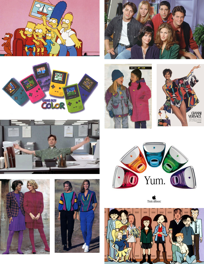
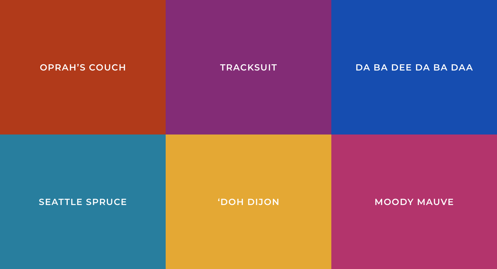
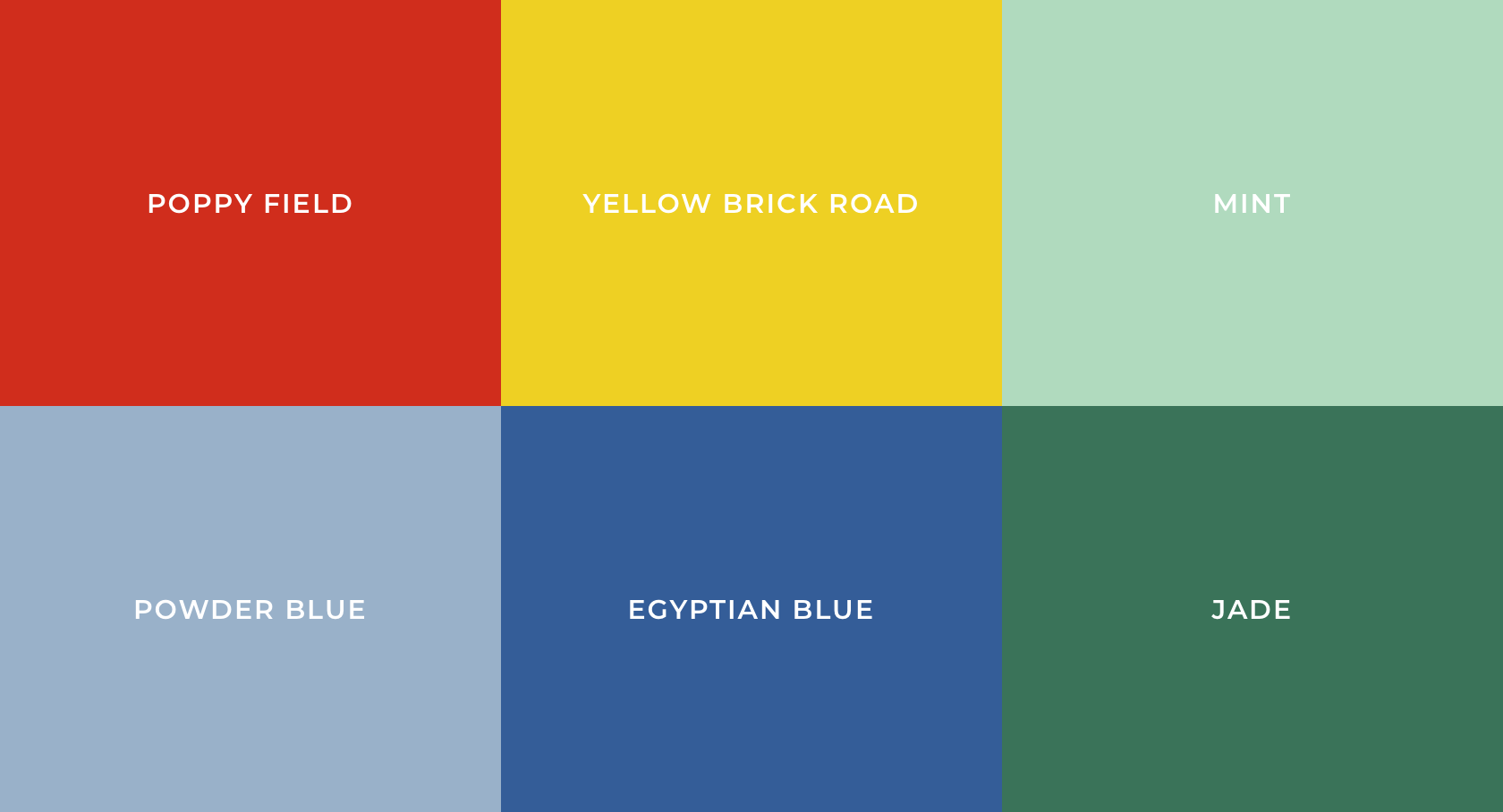
1990s: Jeweled Musings
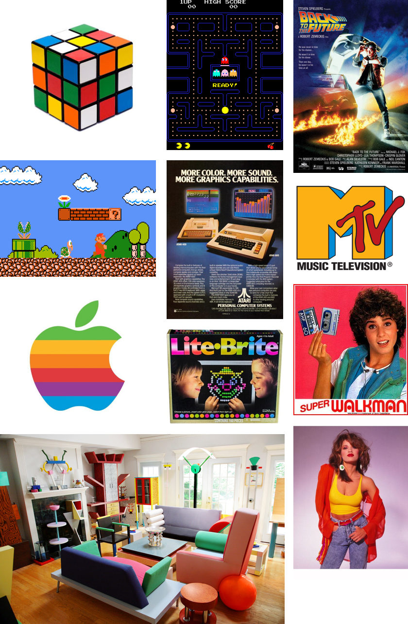
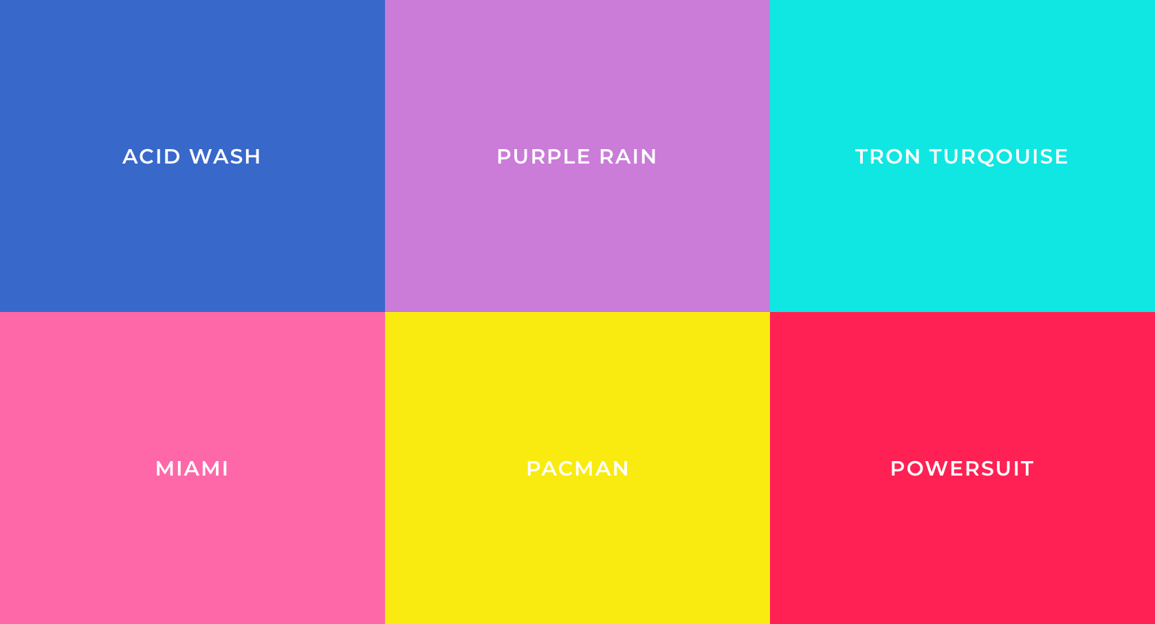
1980s: 8-Bit Wonderand
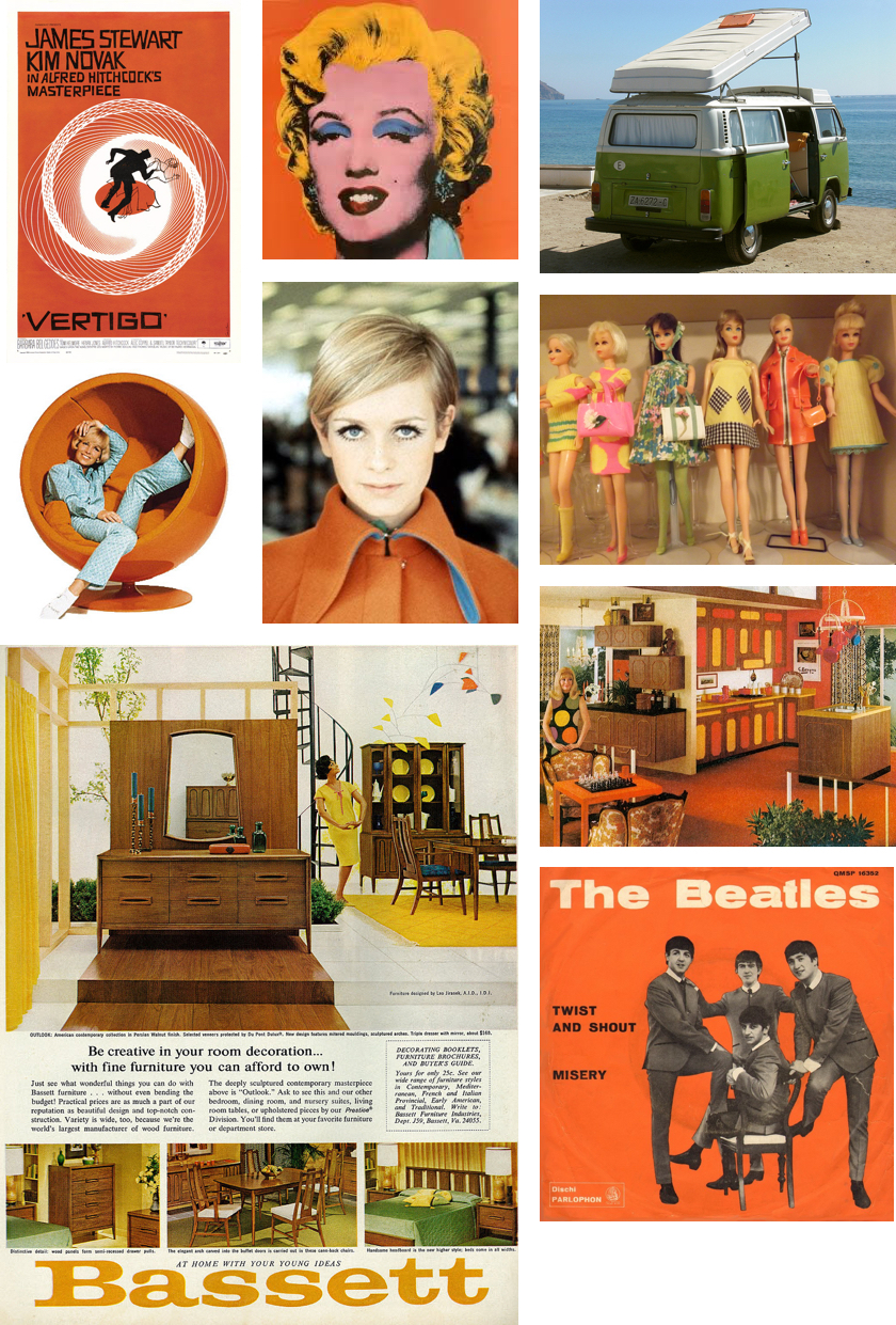
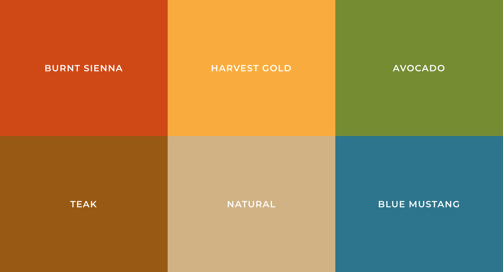
1970s: Any Colour You Like
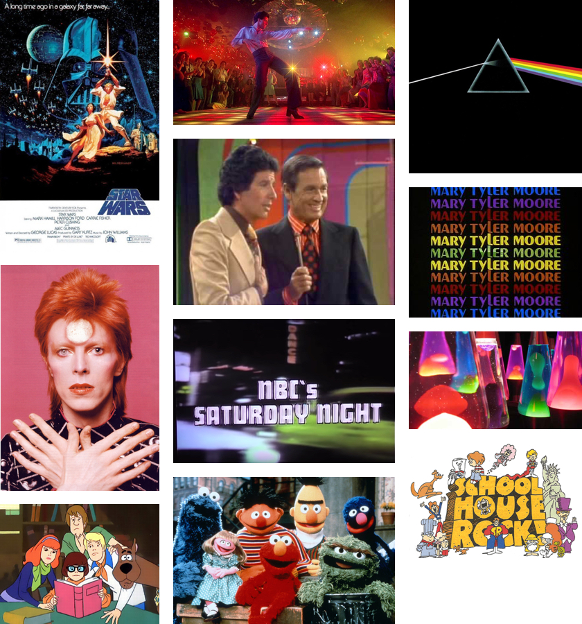
The 1970s were marked by glowing pure primary colors as screen technology made a significant transition from black-and-white to color. Colorful Saturday morning cartoons, Sesame Street, The Price is Right, and, of course, Saturday Night Live all got their start in the 1970s and inspired a generation of youth and teens with their colorful worlds. Kids played with vividly-colored toys such as LEGO, Hot Wheels, Barbie and Play-Doh. Eclectic, vibrant colors from glowing dance floors and neon lights illuminated the disco and punk scenes. Fashions were far more flamboyant: people wore tightly fitting, brightly-colored polyester pants, shirts, and dresses.
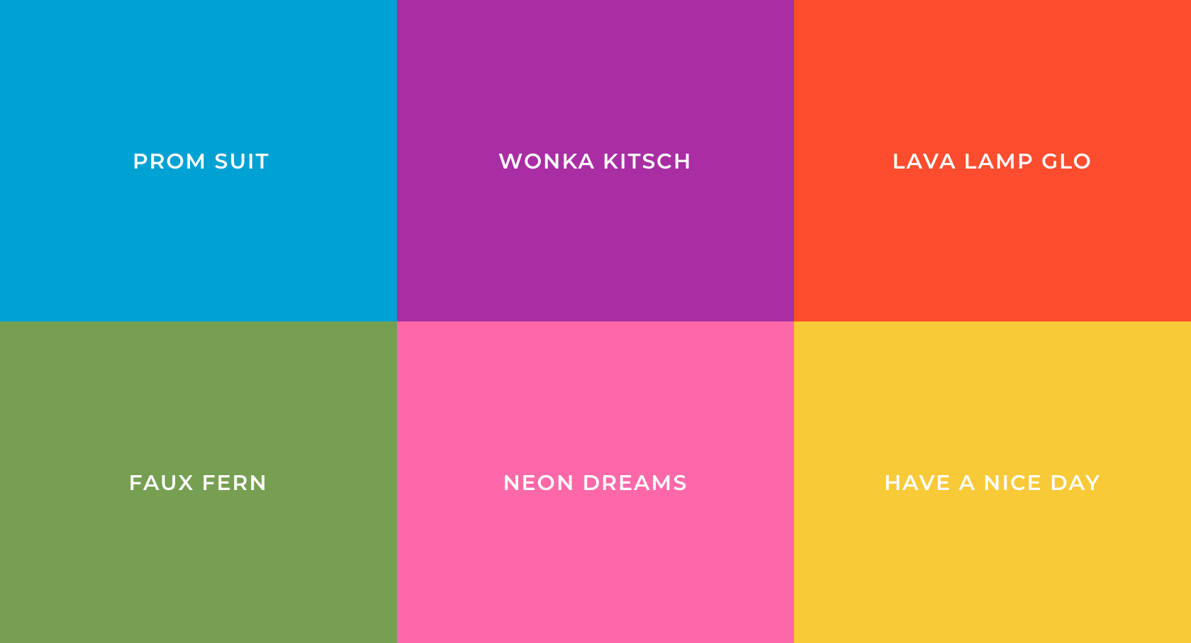
1960s: Mod Madness
1950s: Pretty in Pastels
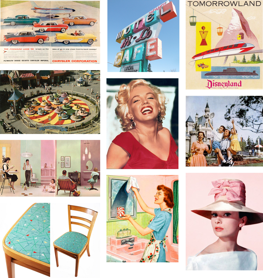
During the 1950s, America came home. Soldiers returning from World War II attended college, bought homes and started families. Another decade of American consumerism, glamor and prosperity swept the nation. Advertisers created razor-sharp campaigns for different family members: mothers, fathers and the newly-created age group: teenagers. Powdery pastels became fashionable and associated with American housewives to convey youth, warmth and joy. Fashion, cars, graphic design, furniture, and decor design were all seeping with delicate pinks, blues, and greens. In the 1950s, you could even buy colored toilet paper. The 1950s was a classic age for families of motorists who flocked to fantastical amusement parks and illuminated atomic-age motels in their streamlined vehicles.
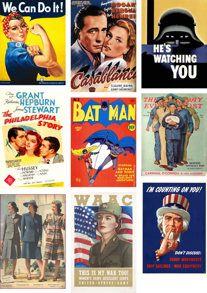
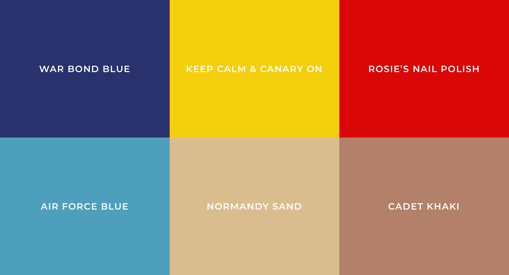
1940s: Patriotism & Primaries
1930s: Escape in Technicolor
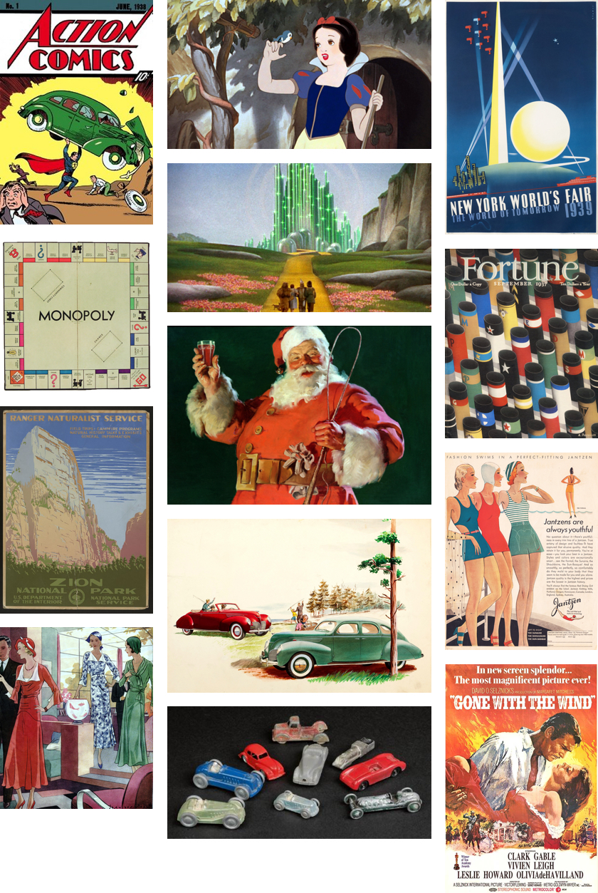
During the wave of the Great Depression, Americans persevered by finding affordable, family-friendly means of entertainment and recreation. The 1930s was also a time that bore timeless, iconic pop culture that audiences today cherish and reinvent for contemporary tastes and ideals. Film, board games, comics and magazines were created during this time period — some names remain as favorites across generations. Despite the dread and despair of the Depression, there were many joyful, colorful, and rich colors that represented the era, which represented how Americans kept magic in everyday life.
1920s: Rhapsody in Gold
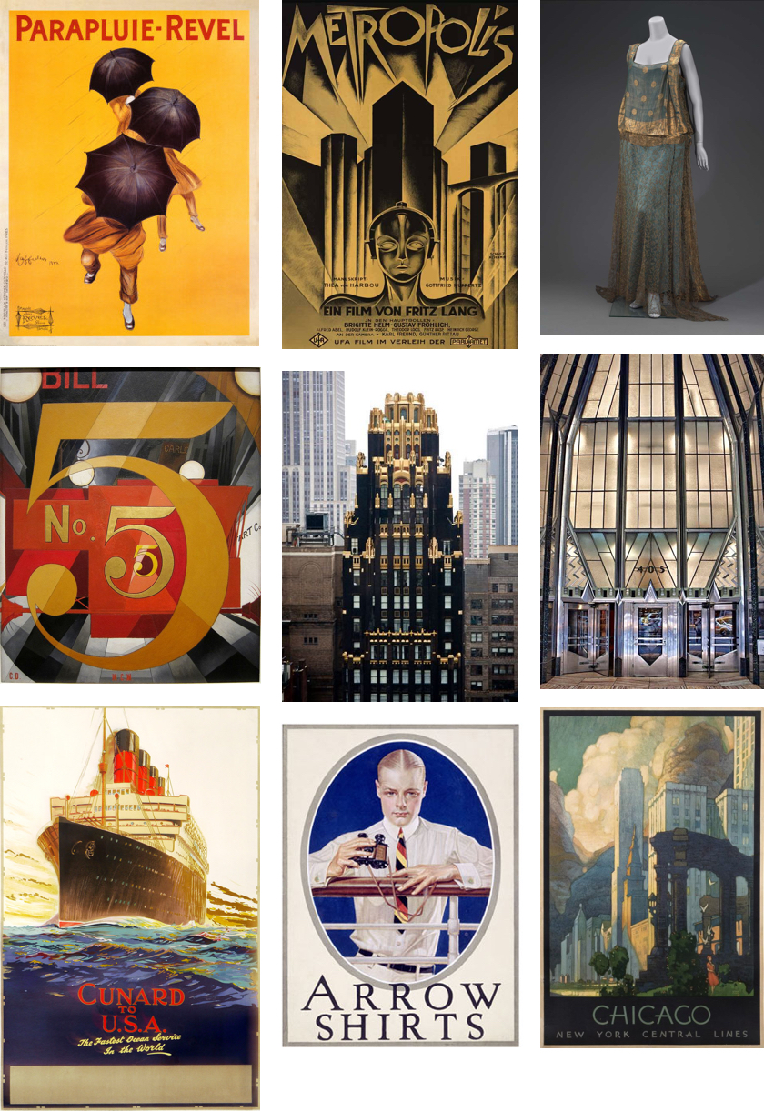
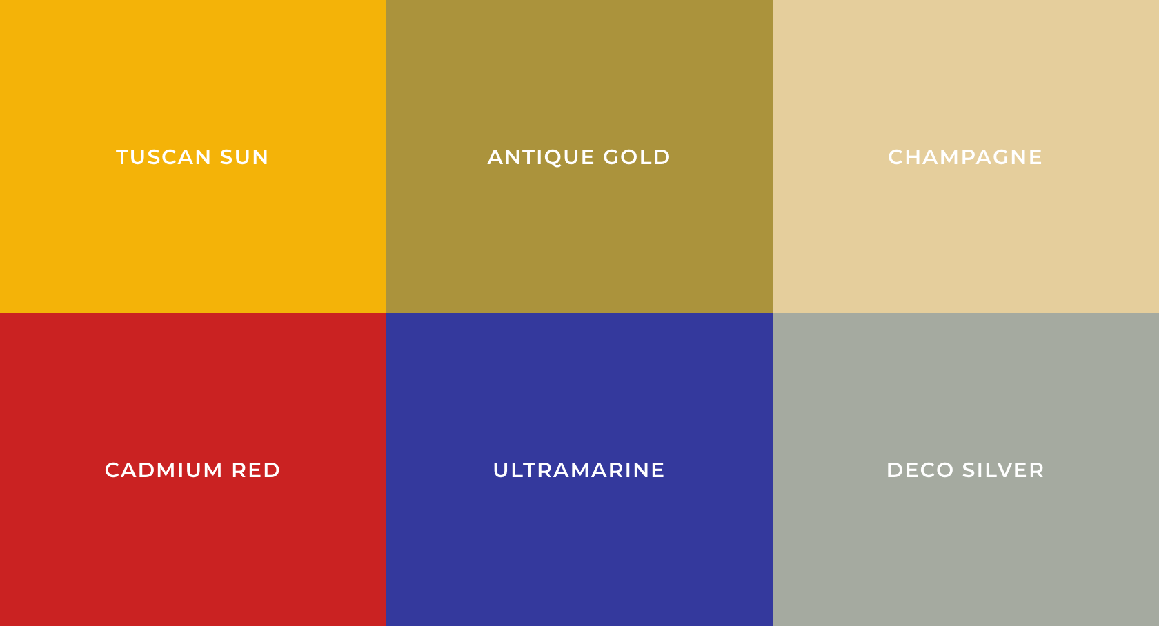
Americans in the 1920s were seduced by luxury, leisure and adventure. Spanning from architecture to fashion to graphic design, yellow and gold expelled energy, wealth and happiness. Art Deco influenced designers, artists and architects across the Western world. Radical Modernist art movements such as Cubism, Futurism, Expressionism and Dadaism influenced some American artists as well. In poster design, artists often employed transparent layers of red, blue, yellow, and black to create a full spectrum of rich colors. Bold, velvety colors, such as ultramarine and cadmium red, also represent the indulgences of the era.